
Every company’s brand tells a story. Throughout KHM Travel Group’s 16 year history, our brand has always represented what we value most–our people.
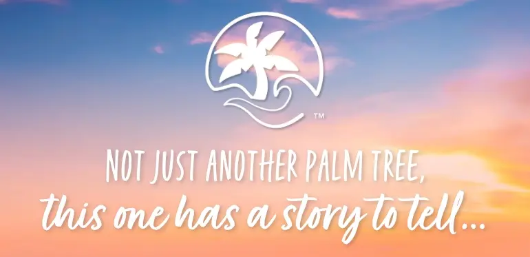
As we developed a new visual representation of our company, there wasn’t any symbol more appropriate than the palm tree. Each frond (or leaf) represents an equal part of our success and the key ingredients to our partnership with travel advisors.
Several design components remain unchanged–the logo’s circular shape, the palm tree, and the blue color. We’ve added new graphical elements like a wave to symbolize the change that is always prevalent and driving our industry forward. The new fonts are more modern and easier to read. And a simpler version (we’re calling it “the icon”) has been created for use on apparel and more.

Our Artist Statement explains more about what each element of our new logo represents.
Artist Statement
The heart of our business is our focus and mission to always put the travel advisor first in all of our actions. Our success as a host agency is measured by the happiness, significance, and success of our travel advisors.
The palm represents the advisor and our mission of empowering, educating, supporting, and promoting independent travel advisors and their role within the travel industry.
The wave represents making positive changes in the industry that supports growth in our advisor community.
The one line that is anchored to the palm represents the changes we’ve made and will continue to make. It’s also the continuity of keeping a constant focus on the needs of our advisors.
We will be rolling out our new logo throughout the remainder of this year. Look for the new design on social media, our websites, emails, and more!